The Stanley Cup Playoffs are getting a makeover for the first time in 13 seasons.
The NHL revealed new branding for its postseason Monday, with the most photorealistic version of the Stanley Cup it has ever used in a logo.
“We felt it was time for a fresh and energetic change. Some of that was coming out of COVID and, having two new broadcast partners, the time was right for us to explore what a new, reimagined Stanley Cup can look like,” Paul Conway, NHL vice president of creative services, told ESPN.
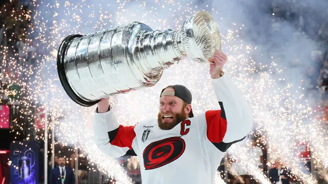
The NHL revealed a new, photorealistic design of the Stanley Cup on Monday. Courtesy of the NHL
The NHL has used the same basic logo for the past 13 seasons. It worked on reimagining that logo for more than two years.
The redesign had three main components:
Fonts: The design team wanted to create new fonts that were grounded in the Cup’s history. Taking inspiration from the 1925 Stanley Cup winning Victoria Cougars’ etching on the trophy, the NHL created “Victoria SC Serif.” The second font was inspired by the entrance to Montreal’s Windsor Hotel, which is where the NHL was founded in 1917. They named it Windsor Sans.
Updating the Cup: The Cup illustration for the logo is more photorealistic than previous incarnations. The designers went through “hundreds” of incarnations, attempting to mimic the reflective quality of it. For the first time, the etchings on the trophy have been highlighted, which was something NHL commissioner Gary Bettman had requested.
“We had originally presented the Cup illustration to Gary during the approval process. He thought it looked great but he said, ‘It’s missing the etchings,'” said Conway. “It really brought it over the finish line. It’s the only sports trophy with every winner etched on it. Why wouldn’t you want to tell that story?”
Holding the shape: Along with the wordmark and the Stanley Cup, the logo is framed by the shape of a championship banner one might find hanging inside an arena.
The finished logo can be customized for all 32 NHL teams, including the application of the logo to colored backgrounds. The designers said there’s also the opportunity to create animations around the new logo.
“All players dream of having their name engraved in immortality, and it is every NHL team’s mission to raise a championship banner. And we wanted to visually capture and evoke the majesty of Lord Stanley in a manner that both respects the history and represents of the future of this great game,” said NHL chief brand officer and senior executive vice president Brian Jennings.
Got a story or tip for us? Email Sports Gossip editors at tips@sportsgossip.com
Want More From Sports Gossip?
For all the latest breaking Sports Gossip, be sure to follow SportsGossip.com on Facebook, Instagram, and Twitter.